top of page
Clean Force
Logo & Business Card Designs

Design Process
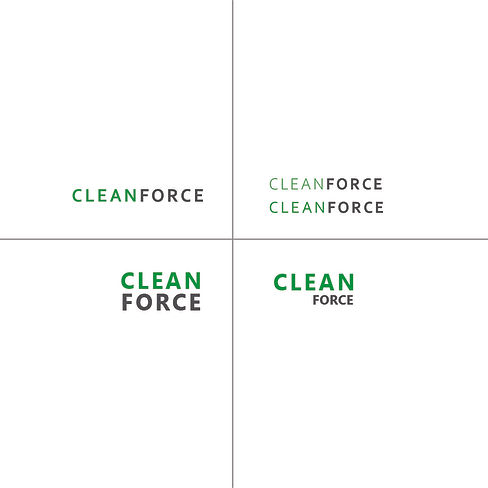
The idea behind the Clean Force logo was, well, forceful! Strong, all-caps, hard-edged font with a lot of negative space and duotone color. The more negative space there is, the cleaner the logo feels, and for a cleaning company that is everything. In looking at this logo, you have an idea of what this company does without needing a pictograph.
The Final Design
We ultimately landed on one font weight for the heading, and a lighter weight on the subheading. The duotone Kelly-green and dark gray keeps the illusion of two words without needing to space accordingly. The Corbel font has hard lines, sharp corners, and nice spacing to keep the text breathable and clean.

bottom of page